
"It looks nice!" Yes. But that's not enough. Because user-friendliness, also known as "usability" or "UX design" in marketing speak, is about more than just looking good. It's about how users interact with a company. In other words, whether they stay on a website and trigger a conversion - or bounce.
This is precisely the challenge: the most beautiful website look is of little use if users do not intuitive find what they are looking for. This is exactly where user-friendliness comes in.
In this ultimate guide, you'll find out what you should pay attention to when creating a main navigation in WordPress, how to optimize your homepage in a user-friendly way, how your content really resonates with users and why testing and analysis are essential. Your benefits: Improved visibility, conversions and brand loyalty for your customers. Satisfied clients who are happy to come back and recommend you to others.
WordPress user-friendliness: goals and key success factors
User-friendliness means that visitors can easily find their way around a website. And in such a way that they reach the operator's goal quickly. So: If a website operator wants to sell a seminar, make sure that the visitor gets to the right page without any detours, quickly grasps the information and intuitively recognizes what they should do next: book the seminar.
Key success factors:
- Fast loading times
- Easy navigation
- Clear presentation of the contents
- responsive design
- barrier-free presentation
- clear call-to-action
WordPress homepageCreating trust and orientation
The homepage is THE digital shop window. Regardless of whether a website is being visited for the first time or someone is returning after a long period of online research: the homepage provides an overview. Even newcomers often visit the homepage to get an overview of the company.
No more, but also no less. Make sure that the homepage makes it clear at first glance who the company is, what it offers and why users are in the right place.
Home page - what you should look out for:
- Avoid overloading the start page
- Focus on the stars (products or services that are really relevant)
- visually clean
- thematically separate content separately
- Set recognizable call-to-action elements
WordPress main navigation: logical and easy to understand
Most websites need a main and a secondary navigation. Depending on the scope of the offer, the navigation can also contain further levels. The logo is at the top left of every page by default and always links to the homepage. With the main navigation, you take the user "by the hand", so to speak, and lead them clearly, quickly and without detours to their destination.
Website example of a clear navigation:

Store example of a clear navigation:

Main navigation - what you should look out for:
- Focus on the core elements of the offer
- create a clear structure
- Use easy-to-understand terms for menu items
- Limit your main menu items to five to six menu items
- name products and services first and foremost and
- Avoid more than 2 levels with regard to mobile use
- Place links to the legal notice or data protection in the footer
Orientation: ensure a clear overview - always and everywhere
Always show users where they are at the moment. Especially newcomers to the site need to find their way around. Even users who have already clicked through several times often no longer know exactly where they are.
Orientation - what you should look out for:
- Clear identification of the navigation level, e.g. by a different color of the link text or by a different background color of the navigation point
- use breadcrumbs for deeper page structures, which show the click path and the current position.
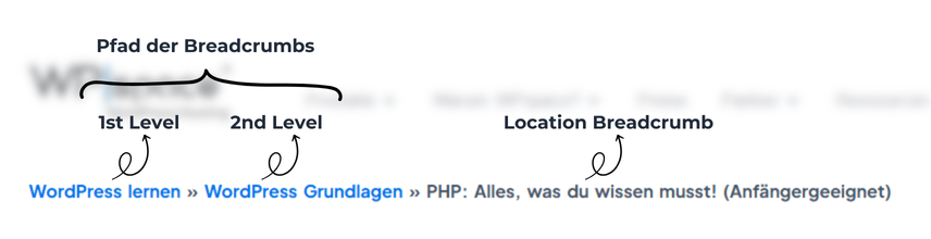
TipBreadcrumbs are best practice, especially for online stores, as they quickly and easily show which product subcategory you are in.
Reader-friendliness: Structuring WordPress content clearly and concisely
Texts on the web are not read, but scanned. The solution: Set structuring anchor points that catch the eye. This allows the content of the page to be grasped quickly. It doesn't work without a clear structure - neither for users nor for Google.
Readability - what you should look out for:
- clear paragraphs
- Meaningful main and subheadings
- recognizable hierarchy (e.g. color, font size)
- Most important information at the beginning
- get to the point quickly
- Use standard formatting (lists, quotations)
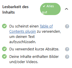
Tip: The free SEO plugin Even the free version of "Rankmath" analyzes your texts for readability of title and content. If you implement these tips directly, you can increase reader-friendliness in the shortest possible time.
WordPress content formats: It's all in the mix
In WordPress, you can implement content in all kinds of formats: infographics, how-to guides, videos, podcasts, 3D graphics and animations, 360° views, studies, interviews or with the help of e-books or voice assistants. As an alternative to pure text content, you can often explain products or services more transparently, simply and clearly.
Content formats - what you should look out for:
- use different content formats (infographics, videos, podcasts, e-books ...)
- choose formats that bring the greatest benefit to your target group
- Transcribe videos and make content readable
- remember: content marketing is SEO
WordPress updates: keep content and technology up to date
Relevant, fast, responsive and secure: users expect up-to-date, relevant and well-prepared content on company websites that is easy to read and access on all devices. Keyword: content audit. Fast loading times and a high level of security in terms of encryption and data protection are standard.
Updates - what you should look out for:
- Keep content up to date, throw out outdated content
- Check responsive design regularly
- Test forms, configuration and ordering processes
- Use clean, up-to-date code (e.g. HTML5, Schema.org)
- Ensure complete encryption
- lead your WordPress maintenance regularly through
TipYou can sort your pages and posts in WordPress by date. If you choose the sorting from oldest to newest, you have a great overview of which post should be updated again.
Define goals: Optimize your WordPress website effectively
"What do you want to achieve with your website?" You should start every WordPress project with this question. Because without clearly defined goals for your customers, no website can be truly successful. Therefore, clarify at an early stage how the company wants to position itself on the web and what goal the website should fulfill. Only if these goals are clearly defined can you effectively align the design, structure and functions accordingly and build subsequent marketing campaigns on them.
Defining goals - what you should pay attention to:
- Possible goals (operator): sell, generate leads, inform
- Possible actions (user): buy, contact, register or inform
- Make the primary goal and action clearly recognizable on the website
- Match visual language, colors and texts to the target
- Design navigation logically and purposefully
- Place call-to-action individually and visibly
Landing pagesIdentify, define and optimize in WordPress
A central question for every usability concept is: Where do users land? This is often the start page. But not only. Cross-entry via links and landing pages is on the rise. The aim of landing pages is for users to "land" directly on a specific product or offer page. This is often done as part of marketing campaigns.
The following applies to a really good landing page: clarify the W questions, clearly present the benefits of the offer, build trust step by step. You make sure that content, design and call-to-actions work together perfectly and that the user is led to their destination without any detours: Conversion!
Landing pages - what you should look out for:
- Identify the most valuable pages
- use web analytics tools to understand user behavior
- test images, colors and texts against each other
- Optimize the display variant that produces the best results
Analyze: Understanding users better, continuously optimizing user-friendliness
Are your customers investing a lot of money in their WordPress projects? Show them that the investment is worth it! Show your customers how important it is to understand your website visitors and their needs, wishes and requirements as precisely as possible. This is the only way to optimize an offer - and you can implement the WordPress project in a truly user-friendly way.
Analyze - what you or your customers should pay attention to:
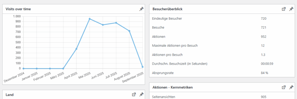
- uses a professional web analysis tool (e.g. Google Analytics, Matomo, etracker ...)
- may use free tools such as Microsoft Clarity to evaluate user behavior in detail
- regularly checks and interprets user data
- questions figures instead of just reading them off
- Translates insights into concrete business goals
Testing: for more user-friendliness with A/B tests
The bad news is that there is no such thing as a 100% perfect WordPress website. Nobody knows exactly which image, which color or which text appeals to users in the best possible way. The good news is that A/B tests can be used to find out what appeals to the majority of users. This involves alternating between two versions of a landing page - and evaluating which version achieves a goal better.
Testing - what you should look out for:
- Many analysis tools have integrated A/B test functions
- Alternatively: use specialized providers (e.g. Optimizely, Adobe Target, VWO)
- No experience? Start small and test step by step!
- Change only one central element per test run (e.g. image, color, headline)
- A test run can take several weeks or months to obtain adequate data
- Results can thus be compared and evaluated more clearly
- Alternatively, use benefit analyses or heat maps
Tip: For A/B tests, write down exactly which changes you have made. This way, you can go back to your origin if the results are negative.
User-friendliness is a joint project - right through to management
As you can see, you alone cannot ensure optimal user-friendliness for your WordPress projects. But you can proactively support your customers.
To improve visibility, purchasing decisions and customer loyalty, it is worth thinking about user-friendliness from the goal: What should visitors do? What do they expect? Where do they get stuck?
Only if the visitor's experience is convincing in the end will everything beforehand work. This is exactly what is user-friendly: the user is satisfied from start to finish.