


The good things come at the end. Where there is an end, there is always a beginning! And vice versa, where there is a beginning, there is always an end. Of course, this not only applies to life as a whole, but also to websites. Every successful website today has a header and an end, the so-called website footer. The content is located in between. And it's the footer that we're looking at today.
Today we would like to show you how you can easily and quickly create a website footer in Divi with the Divi Builder.
You're probably wondering why we create the footer in the Divi Builder and not in the Customizer? Good question. There is an even better answer. In contrast to the Customizer, you have much more design freedom (graphically & functionally) with the Divi Builder. What's more, you can add the footer dynamically as a global element to all your pages/posts. This means that when you have finished designing your page, the footer will remain, while the page content will be displayed as expected. You can also hide the footer for certain pages/posts, export it as a single element and import it into other installations, animate elements within the footer, etc. Your Design options for your website footer here are significantly larger.
Why is a footer so important for your website?
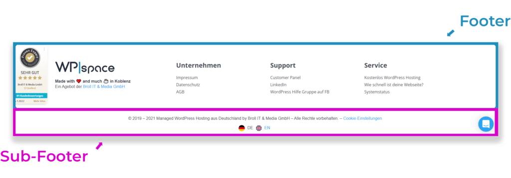
A bit of theory to start with. A footer usually consists of two elements Footer and the Sub-Footer.
You're probably wondering what belongs in the perfect footer/sub-footer?
There are no limits to what you can do. But there are a few elements that you will find again and again in most footers in the world.
For example, the following elements are recommended for a professional website footer to use:
- Call-to-action e.g. for a newsletter
- Menu
- Contact us
- Service area
- Social media buttons
- Payment providers you work with
- Confidence-building logos, such as test marks, quality seals, etc.
- etc.
By the way, mandatory information also belongs in every proper footer:
- Privacy
- Imprint
- AGB
- Terms of payment
- Revocation options
Enough theory about website footers. Let's get started.
First steps - Installing Divi
Before we start, you should have Divi installed and set up. We will tell you exactly how to do this in our article about the installation of the Divi Theme and in our guide to the correct configuration of the Divi Customizer.
Already done? Super.
Setting up the website footer in the Divi Builder

Add global footer
First of all, we go to the "Divi" tab in the dashboard and click on the tab called "Theme Builder".

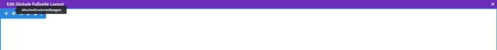
You will now see a tile called "Default website template". Here you click on the menu item "Add global footer" and then on "Create global footer". This will create a footer from scratch. This is what it looks like when a new global footer has been added.

Now just click on the pen.
Your website footer - the centerpiece
You will now be taken to the Visual Builder. An empty section (blue frame) has already been created here. We will use this as the footer. Later we will create a second section, which will then serve as a sub-footer. But first, one step at a time.
First, we change the section background color of the website footer according to our wishes. Simply click on the cogwheel in the blue frame ("Section settings") and select the desired color under Background by clicking on the pipette symbol.
In our case, an elegant dark gray (e.g. #3f3f3f).

Save. The window closes.
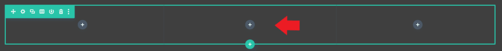
We can now adjust the columns by clicking on the row settings (cogwheel in the green frame).

We divide the row into 3 columns of equal size. To do this, we add 2 more columns under Column structure. To do this, click on the plus sign.
Then save the entire row with all columns. Close the window.

Contact area in the website footer - almost always included
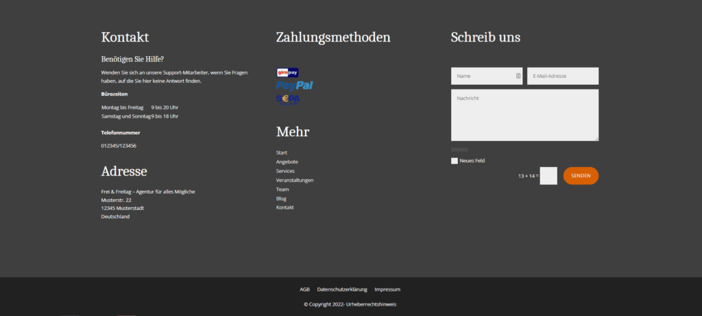
In our example, the first column will serve as the contact column, where all contact details and opening hours are located. Here we add a new text module by clicking on the gray plus sign within the first column.

A window will open. Scroll all the way down and then click on "Text".

The contact details can be entered using the text editor under "Content - Text".

Here is a sample text that you are welcome to use and modify for your own purposes:
Contact us
Do you need help?
Please contact our support staff if you have any questions that are not answered here.
Office hours
Monday to Friday 9 a.m. to 8 p.m.
Saturday and Sunday 9 am to 6 pm
Phone number
012345/123456
Address
Frei & Freitag - Agency for all kinds of things
Musterstr. 22
12345 Sample city
Germany
Then confirm. Done.
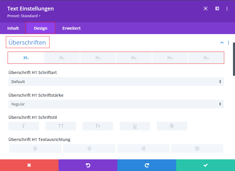
As far as the formatting of your texts is concerned, if everything is set correctly in the Customizer, the formatting from the Customizer should take effect. Headings can be marked as H1-H6 directly in the text editor.

As an alternative to the Customizer you can also use your own formatting under "Design - Text" or "Design - Headings".
We save everything and close the window.
The second column: Payment methods & menu
And let's turn to the next column of your website footer. We would like to integrate two areas here. Firstly, we would like to include a menu and secondly, an area with icons of the payment methods we offer. Let's start with the payment methods. For our example, we use three payment methods. PayPal, GiroPay and SEPA direct debit. We now go to the second column and add a new text module and three image modules by clicking on the gray plus sign.
Then save. The whole thing should now look like this.

In the settings of our text module, we assign a heading with the name "Payment methods" and confirm the process.
Now we click on the first cogwheel (Settings) in the first image module to add our icon.
We can upload our icon under the "Image" tab. Then save it.

We repeat this twice for the other two icons. Now all the icons are there, but not necessarily in the desired size. To make all icons the same size, we go back to the individual settings of our three image modules under "Design - Set size" and adjust the height. In our case 30px.

We also adjust the bottom margin under "Design - Space". Here we assign 10px under "Outside distance (Margin) - Bottom". Save. We do the same for the other two images. You can also simply select the module settings via the three dots of the module, then Copy module styles and paste the module styles into the next module via the three dots.
Now let's look at the menu that we want to add under the payment methods.
First of all, we give the menu a new title bar with the label "More". To do this, we create a new text module directly below the three image modules and assign a heading. Save. Close window.
Then it's on to the actual menu. It can be said that the menu is controlled via WordPress. We will show you how to do this here in our short excursus.
Excursus: Creating a menu in WordPress and integrating it as a widget in the footer
The most convenient way is to create a new menu under "Design - Menu". You can find the tab in the WordPress menu. Simply click on "Create a new menu" and assign an easy-to-remember name for the menu. In our example, we'll call it Footer Menu. Then we assign the menu to a position in our theme. And you guessed it, of course our brand new menu belongs in the footer menu. Now select the relevant pages for the menu. Save under "Save menu". Done.

Then we click on "Design - Widgets" in the WordPress menu. We open the tab "Footer area #1" and add a navigation menu (at the bottom) by clicking on the plus sign - "Browse all". Here we can assign a title and select our previously created menu from the drop-down list. We save the whole thing by clicking on the "Update" button at the top right.

Now let's jump back to the footer in our Divi Theme Builder.
We add a new module with the name Sidebar in the desired position under the title bar with the title "More" by clicking on the gray plus sign.
A new window will open.
We select our previously created widget with the name Footer area #1 from the drop-down list.
The menu is now displayed. The appearance can be controlled under "Design - Body text".
The vertical line next to the menu can be hidden under "Design - Layout - Remove border separator".
Save.
Close the window. Et voilà and the second column is ready.
Last but not least - The contact form
In the third column for the website footer, we dedicate ourselves to the integration of a contact form. We click on the gray plus sign in the third column and add a new text module. This serves as the heading for our contact form.
As in column 2, we now place a heading here, in this case "Write to us".
Then save.
Close window.
Now we add a new module (simply click on the gray plus sign) - the actual contact form module. Form fields can be added or customized via "Content" in the settings. For our example, it looks like this.

Click on the cogwheel symbol within the individual fields to open a new "Field settings" window. Here you can navigate to the "Field options" area. And under "Type", for example, add a checkbox*, as used for contact forms in the context of data protection. Then just confirm.

* Note on the subject of GDPREven if this tutorial is of a more technical nature, it is also important to deal with the legal aspects of contact forms. Therefore, the General Data Protection Regulation (GDPR) applies to contact forms. Before publishing your contact form, please check whether it complies with the requirements of the GDPR.
You can find helpful tips at https://www.datenschutz.org/kontaktformular/ or with your legal advisor.
Back in the contact form settings under "Content - Email address" you can enter your email address to which inquiries should be sent.
Under "Design - Fields" you also have the option to customize your contact form. For our example, we set the field font color to white. As we have already adjusted the button style in the Customizer under "Customizer - Buttons (Button) - Style of the button (Button) & Style of the button (Button) on hover", the styling for the button is not necessary. You can access the Customizer in the WordPress menu under "Design - Customizer".

As an alternative: If you prefer to customize your button, you can do this in the Divi - Theme Builder within your contact form module under "Design - Button".

What would a website footer be without a sub-footer
Mandatory information in a footer is mandatory
Of course we would like to add a sub-footer to our website footer. Here we integrate necessary information (such as imprint, data protection, etc.) for our site.
A tip: The Wiesbaden Chamber of Industry and Commerce has summarized the most important aspects of mandatory information for websites. Here you get to the article.
Our Sub-Footer Menu With our mandatory information, we are not integrating a widget this time, but using the Divi menu module. We create our menu in advance in WordPress under "Design - Menus" (see Excursus).
Then we switch to our theme builder in Divi. So that we can add this menu, we open the settings of our global footer to add a sub-footer. Our previously created footer opens. Click on the blue plus sign to create a new section directly under our existing menu.

We assign the "Regular" setting here, select a single-column layout for "New row" and add a new module with the name "Menu".
We then select our previously created menu from the drop-down list under "Content - Menu". Save. Close the window.
We go back to the section settings by clicking on the cogwheel in the blue frame.
Here we change the background color under "Content - Background" to a darker grey, in our case (#212121).
We do the same with the background color of the menu, which can be found in the settings of the menu module (click on the gear symbol in the grey frame) under "Content - Background". Again #212121.
Under "Design - Layout" we set the menu centered and under "Design - Spacing" we assign a lower outer spacing of 15px. Save and close.
The copyright notice must also be included in the footer

Another part of the sub-footer is the copyright notice. To avoid having to adjust the year in the copyright notice every year, there is a great function in Divi that does the whole thing for you. dynamic contents. And that's what we want to show you here.
We now add a new text module under the menu with the mandatory information. We click on the following symbol with the name "Use dynamic content".
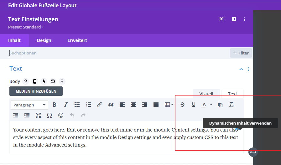
This is what the symbol for the integration of dynamic content looks like.

A new menu opens. Here we click on "Current date".
Enter the following text in the "Before" field:
"© Copyright "
Enter this text in the "After" field:
"- Copyright notice"
Where copyright notice stands for your own individual notice. For a clean notice, we recommend that you clarify the exact wording with your legal advisor. We change the date format to custom. This should actually be "Custom" and was not translated correctly. Under "Custom date format" we enter the letter "Y". This is the abbreviation for the current year.

After that, the whole thing looks like this.
© Copyright 2022 - Copyright notice
If the spaces are not displayed correctly, you can adjust them in the "Before" and "After" fields.
We align the text centered under "Design - Text - Text alignment".
Mmm. That's it.
Unfortunately not. We have only worked on the desktop version so far. It is also important that our website footer looks smart in the tablet and mobile view. To achieve this, we are now switching to the tablet view. The best way to do this is to click on the tablet icon in the gray menu at the bottom left.
You will probably notice that your menu with the mandatory information is displayed as a hamburger menu.
How can this be solved? You can change this display in the website footer with a simple code snippet.
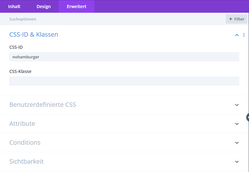
First, we recommend assigning an ID for your menu module under "Advanced - CSS ID & Classes". We have named the ID "nohamburger" here as an example. However, you are also welcome to assign your own ID in lower case letters, without # and without spaces. Save. Close window.
Then go out of the builder and open the Divi settings under "Divi - Theme options".
Here you select the tab "General - General" and scroll down to the bottom where you will find an input field with the name "Custom CSS".

Here you can enter the following code:
@media (max-width: 980px) {
#nohamburger.et_pb_menu .et_mobile_nav_menu {
display: none;
}
#nohamburger.et_pb_menu .et_pb_menu__menu {
display: block;
}
}
You are welcome to replace #nohamburger with your own ID that you used in the previous step.
The last step is to check the mobile view of your website footer.
If you find the font in the mobile view too large, you are welcome to adjust the font size in the individual modules. However, make sure that you are in the correct view within the respective settings. You can find this out by clicking on the phone icon with the mouse.
Phew, you've done it. And you should now be able to admire your own website footer.
Conclusion on the individual website footer
As you can see, it takes a little effort to create a customized website footer with Divi.
An effort that is worth it in my opinion. Because you can put everything that is important for your users in the website footer, you have the opportunity to get more out of your website.
If you would like to find out more or have any questions, please leave a comment. We would be delighted to hear from you.
